Three cycling artists you’ve probably seen but not heard of

Cycling has a lot in common with art. Matt Rudd from the Let’s Ride team takes a look at this relationship between riding and creating, and shares some of his favourite work by artists who cycle.
At its best, cycling is about freedom. Colour. Connection. It always has been, from the very first time a test rider trusted gravity enough to push off and trust the machine they sat on. And what a machine! The humble bicycle is arguably the finest and most economically designed invention ever, so unsurprising that it quickly moved from a functional mode of transport to a desirable, even beautiful object.
Art, of course, draws on similar themes – there are a few guidelines but artists are free to break them. There’s endless colour to choose from. The artist gets to connect with their activity at any level – and this is perhaps the greatest thing art and cycling have in common – they are both truly democratic. You’re free to choose your level, decide how much you spend on equipment and make of it want you want to make of it!
And making things – cycling-related things, is what many artists have chosen to do over the years. Cycling seems to naturally inspire expression (remember all those Yorkshire streets bathed in flags, banners and sculptures to joyfully usher the Tour de France/Yorkshire riders through?). Read on for just a few examples of some of my favourite artists, paying homage to the venerable bike.
Shan Jiang
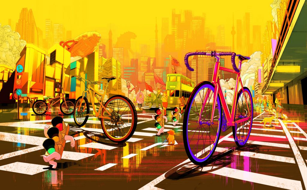
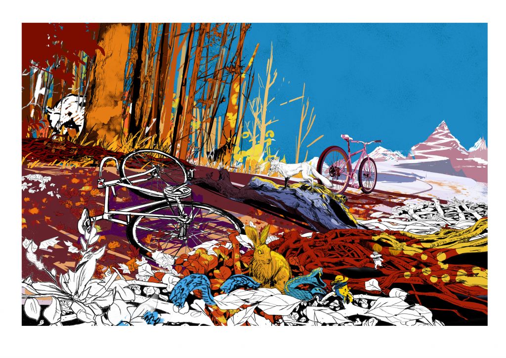
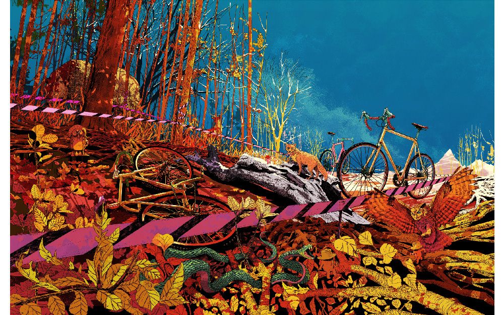
Shanghai-based illustrator Shan Jiang is a fantastic talent, with a really quirky, almost surreal flavour to his work – bold bright colours and lots of strange little unexpected characters popping up among the bikes. It’s no surprise that the creators of The Ride Journal chose Shan to craft all ten of their amazing covers. Each issue was packed full of fantastic cycling illustration, graphics and photography (and lots of great writing too), so it’s credit to Shan that he got to front such an eclectic mix of artistic work.
Shan’s website states: ‘behind every nice thing, there is some kind of suffering’. That often rings true for a bike ride – spectacular view as payoff for the pain in the legs on the climb up!
The artistic process
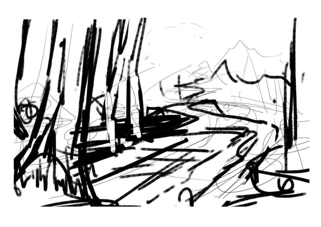
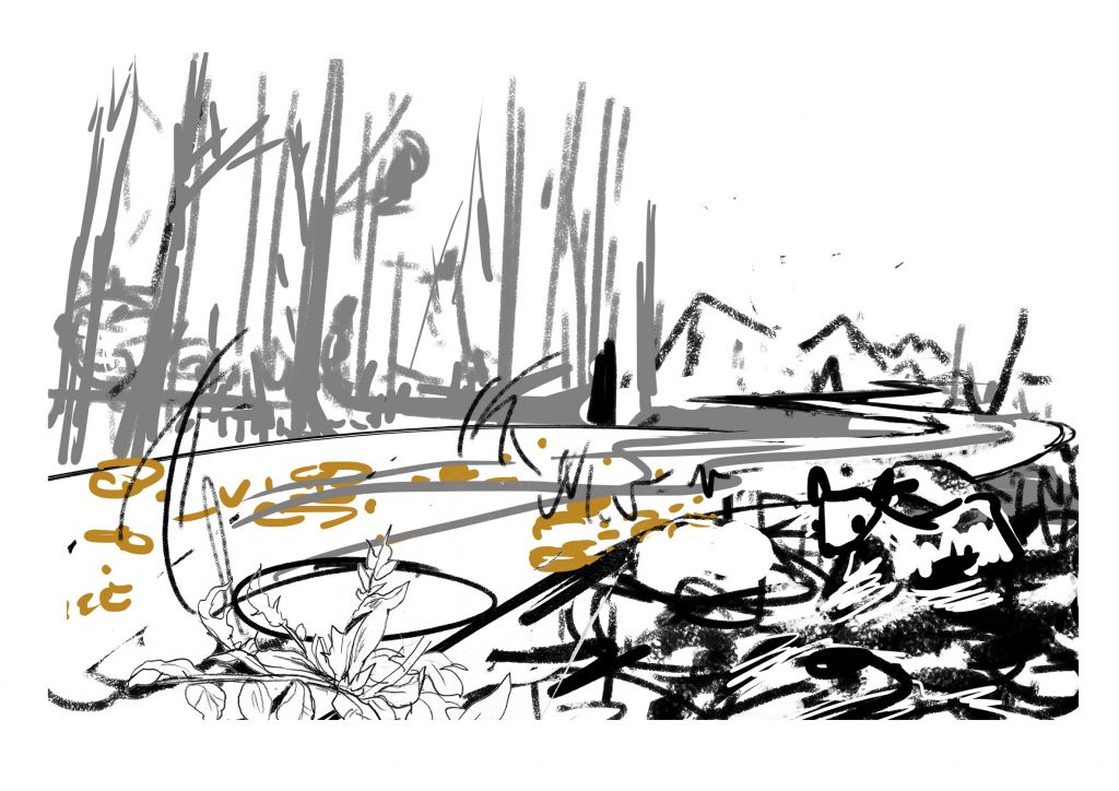
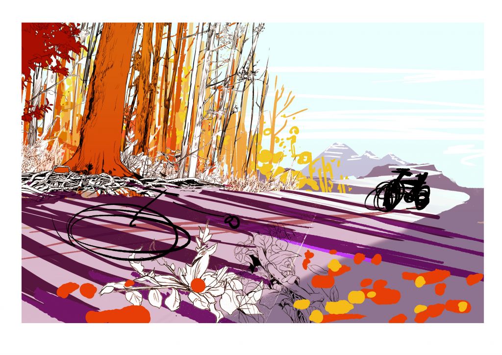
Shan very kindly took the time to answer a few questions, and generously showed me his process for each piece – from blank paper through to intricate final image.
Shan started each cover by making a hand-drawn sketch, using pencil or pen for the line art. This was then scanned in to the computer and the vibrant colour added. There was a bit of back and forth between Shan and Andrew Diprose (The Ride Journal art director). Andrew would give an idea of the kind of bikes he wanted to feature on the new cover, then Shan would research the bikes, come up with the ideas and then work out a rough sketch to send back. Once everyone was happy, Shan would then spend one or two weeks to carry out the final illustration, depending on the complexity.
Shanghai cycling compared to the UK
I asked Shan how cycling in the UK compared to cycling in his native Shangai. He reinforced the image I already had of Chinese streets full of cyclists, and said that despite the continuing growth in popularity in the UK, there were a great deal more bikes in the streets and more bike lanes around the city, even going back twenty years to when he was last in Shangai. Shan described to me the rush of riding as part of a crowd of cyclists:
“When I rode with so many others, it was a different feeling than riding almost alone in UK. When I recall the scene, it was almost like I was in a bike parade.”
(Speaking of bike parades: Find the nearest HSBC UK City Ride to you here!)
The earlier print editions of The Ride Journal covers are now sold out, but you can still get your cycling mitts on the last few issues if you’re quick, and they’ve kindly made PDF downloads of all ten issues available too. Check out The Ride Journal website here.
There’s a colouring book of Shan’s work, published by Lawrence King available here... and he’s generously given us permission to make a page available – click here to download and get out the crayons! For Shan's other brilliant creations, you'll find his portfolio here.
Geoff McFetridge
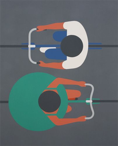
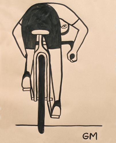
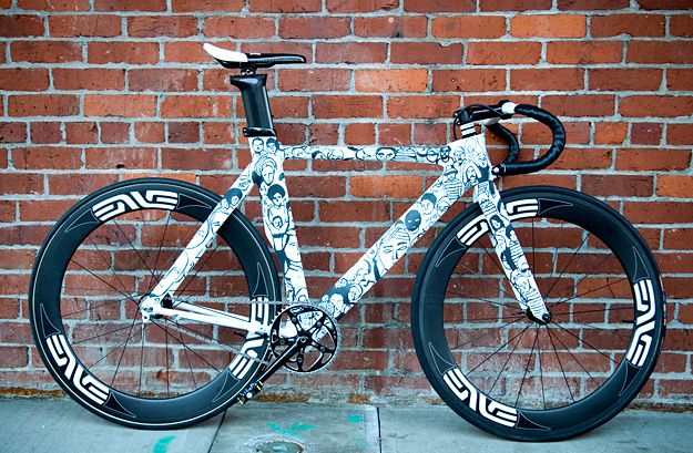
One of my favourite artists, Geoff McFetridge is prolific. His simple yet powerful, instantly recognisable style can be seen on everything from the walls of internationally-renowed galleries to bike frames, cycling jerseys and bidons, all without a hint of watering down his appeal.
In an interview, Geoff explained how he was aware of the elite side of the sport, but that it was the ability to ‘make his own version of the sport’ that really got him into cycling.
“I hadn’t even realised you could do that, just ride up a mountain for fun.”
And Geoff has plenty of fun out on the bike – he’s one of the founding members of Mudfoot, a cyclocross collective in his native California, so they’ve naturally got some of the sweetest kit around (some of which is still available to buy).
He’s got an almost magic ability of giving simple shapes and lines loads of character, almost to the point where his work has its own language, encapsulating and communicating the fun, community spirit of cycling.
More of Geoff’s work can be seen at his portfolio site Champion Graphics.
Kate Moross
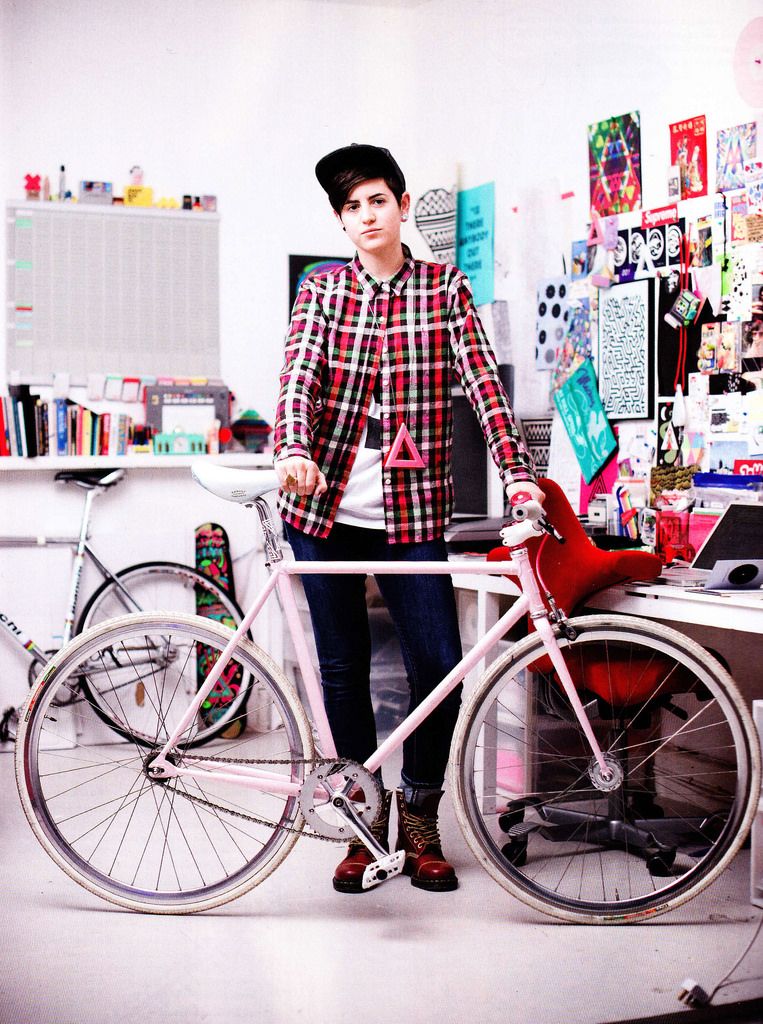
Last in my selection is Kate Moross – another precocious talent, with an output already big enough to make many a veteran blush! After setting up her own record label, directing music videos and applying her distinctive hand-drawn typographic style to a who’s-who list of big clients before she’d even finished a graphic design degree, Kate’s early motto was ‘to make music look good’. I reckon it’s working, with her Studio Moross collective having a big hand in the artwork for loads of big shows and festivals.
When asked what makes her tick, she replied: ‘bike rides, tea, stationery, music’. The squiggles and colour of Kate’s work have also made cycling look good on plenty of occasions, including the fantastic typographic piece she created a few years back for The Ride Journal.
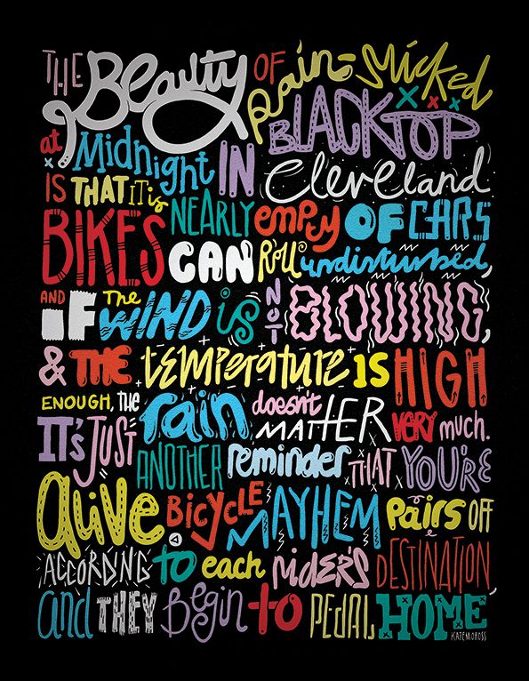
It really gets across the feeling behind that rare cycling occasion when a soaking is worth celebrating.
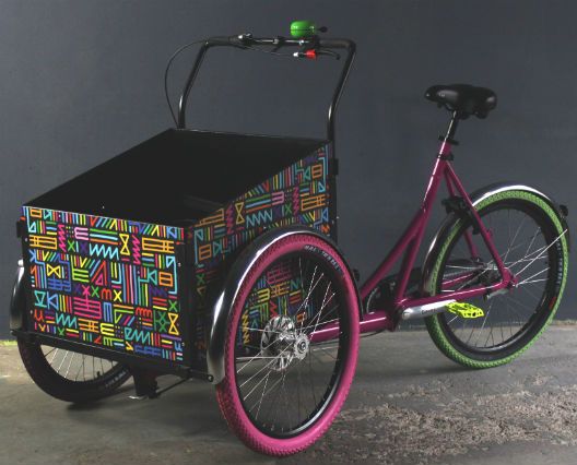
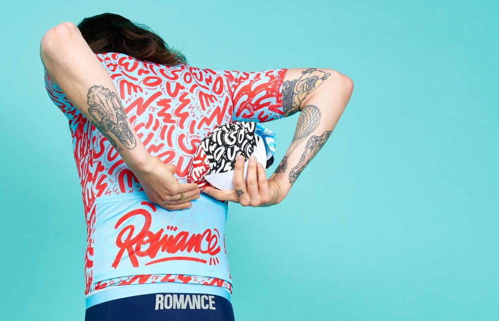
Kate also customised a cargo bike for London Green Cycles, as well as adding her type to some fun jerseys. Both creations really get across the simple pleasure of riding bikes with their mates.
Those are just a few of my favourites, showing that art and cycling truly have loads in common. They both allow you to be yourself, and pay little or no attention to the perceived rules while you go (I’m not talking about the Highway Code here folks, you should always stick to that!). Both offer you the freedom to make it what you want to make it.
Cycling, like art, can be a serious business, but remember that you can choose for yourself. Challenge yourself to go faster or further using the latest cycling technology; or settle for a gentle roll through your local park on a trusted, rusted old faithful when the sun comes out.
It’s up to you – you could even create some cycling art when you get back!
